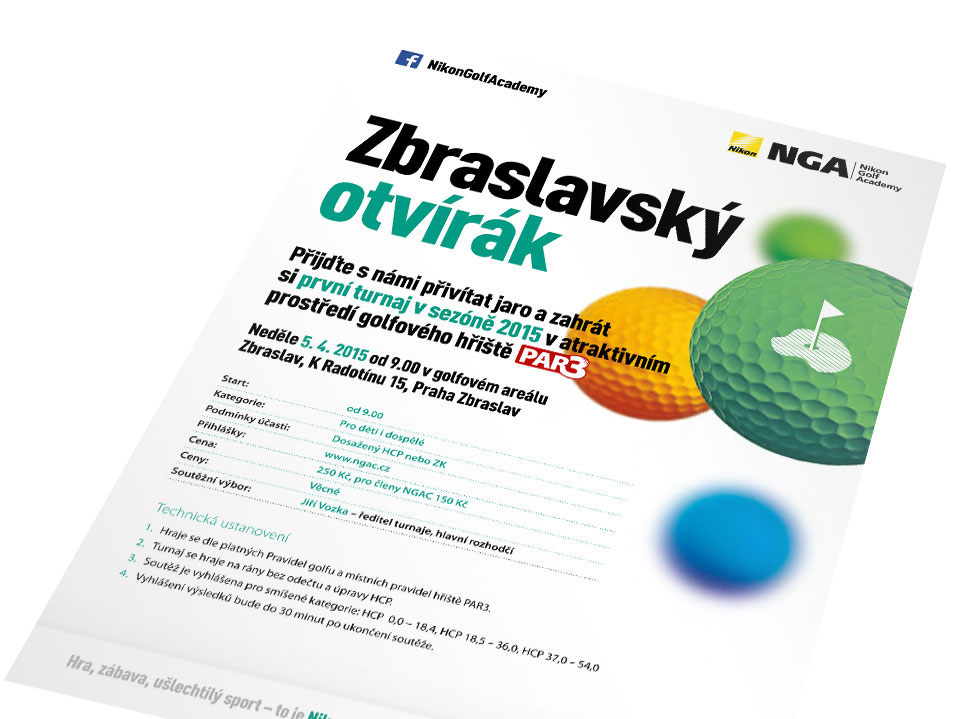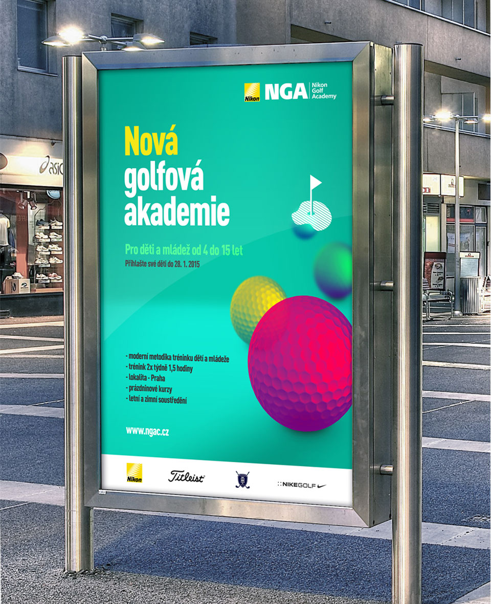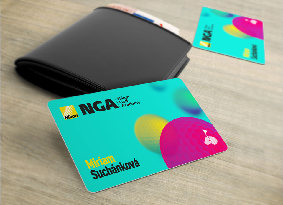

At first the golf school Nikon Golf Academy wished its leaflets had a new and playful visual style. We focused on children who attend the school as well as adults and we came up with a playful design full of colours that clearly distinguished the visual communication of the company from the usual green and white that we are used to in connection with golf. Our inspiration were coulours and the element of repetition of the artistic style of Pop Art. Our client liked the design so we worked on it further and designed more versions. At the end we created new corporate identity of the Nikon Golf Academy. We have designed all of the company´s communication such as bigboards intended for golf course, information on events and tournaments, application forms and health fitness forms for children´s golf camps. The cooperation with our client grew from the initial design of visual style for leaflets into the creation of the new corporate identity.


 More Customers for Myslbek

